|
ExplanationsWhy these pages are the way they are. Purpose of this site is to advance Teppo-awareness in the world. I give its address to people I meet, so they can have fun with games and get to know me better. Next time they meet me they hopefully feel a little more positive about me. I've already printed this web-address to one of my t-shirts... Main design goal has been code that complies to web standards. Y2K-problem taught us that code can live for longer than expected. That is why I have considered the whole life span of this site, not just present time, when I've decided which browsers to support. I have validated the pages every now and then, and their code shouldn't contain any errors (except the pages that have an EMBED-tag because of flash-content.). I have tested backwards compatibility down to Explorer 4 and Netscape 6. If this were some commercial site, like a portal, I might make it work with even older browsers. This is however my site, and as a web authoring hobbyist I have wanted to test modern techniques. Pages have cosmetic differences depending on the browser, and generally speaking they are rendered better with each new generation of browsers. Navigator 4 is an especially problematic browser, and I will sigh of relief when it disappears from users' machines. While I'm writing this, NN 4 has a four percent share of browsers in use globally. I would assume that the percentage is smaller in Finland. Unfortunately NN 4 will live for some time to come. Code has some "oddities" in it. In some places I have defined the same thing with both CSS and attributes. There are DIV-tags that seem to have no purpose, on an invalid page there is a DTD etc. etc. Usually there is a reason for these things, which is revealed when one removes the oddity and tests the page with several browsers, or validates it. For some disciplinary reason I have wanted to use 4.01 strict DTD. This requires that I use style sheets instead of tags to define appearances, and that's what I've done. Only thing that I can't get to work in strict without shaky javascript tricks, is target="_blank", so pages using that are under transitional DTD. Some say opening a link to a new window is evil, but I think it has its uses. For example, the chess clock on this site would reset if its user guide opened to the same window. Secondly, if an image can be be clicked to a larger version, in my opinion it should open to a new window, or returning to the previous page would require a new wait. Anyone who disagrees probably has a fast Internet connection. After all, a mere picture never leads anywhere except back. It is easier to close the new window, than to wait. I would like to use Verdana font, because it is designed to be read from a screen. For example the "tail" in letter e is far away from the loop, which makes the form very open and clear. However, Verdana is larger than other fonts defined to the same size. I would like to compensate this by defining the text to be size 0.85em, but then if the user doesn't have Verdana installed, text would get awfully small. 1em is the text size user has set in his browser. It is not proper web design to change that, because the user may have his own reasons for his choice, e.g. a disability. Usually the default font in browsers is Times, and not the user nor the author can define separate sizes for each font. For now I have circumvented the problem by moving Verdana to the end of font list. First on the list is Arial, because Helvetica is bit crowded in my opinion. I have studied the opinions of web gurus about how to define font sizes. These opinions are often conflicting, and they all have their shortcomings. I say there is no perfect way to define font sizes that suits everybody. It's a matter of choosing your particular compromise. In my case the compromise is that I can't use Verdana. One school of thought says that text width shouldn't be adjusted, because the user will do that by adjusting window. It is difficult to read text if it spans from edge to edge, and in my experience people don't adjust their windows to adjust text width. Therefore I have defined the width of paragraphs to be 28em. For example the text in books is usually somewhere between 9 and 11 cm wide. Centimeters (and inches) are however a poor way of defining element widths, because browsers don't seem to know the monitor dpi figure. On some pages I have broken one basic rule of layout design by making them wider than others. I can't help it, because chess clock was originally designed as an independent page, and it is horizontal by nature. My trip to Spain had originally three columns, but when I fitted it into this new layout, I moved pictures from their own column to the middle of the text. At least the pages fit on a 15-inch, 800-pixel wide monitor, which is the most common type of monitor in use now that I'm writing this. The next most common is larger. If the browser has javascript enabled, then the link that leads to the same page has a little golden sphere in front of it. The link is still functional, which is not good design. Situation is more problematic, if the browser doesn't support javascript, and the sphere doesn't appear. I have used the web editor's include-function to create navigation. This is so that I only need to edit one document, if I want to change navigation on these about 90 pages, where the navigation is the same. If I wanted to remove the links that lead to the same page, I would have to edit each page separately. I could do it once, but if I made some change to navigation, I would have to do it all over again every time! On the contact info page my e-mail address is a picture, not text. This is so that my address wouldn't be harvested by evil spammers. Some programs know how to read text in pictures, so I have scrambled the picture in five ways:
Sixth method might be the use of some really exotic font. In the contact form there is an e-mail address within the HTML-code. It is however a different address. If it starts attracting spam, I will direct it directly to trash, and I'll change the address. I couldn't do it with my regular address, because people may have it in their address books, but in a form it doesn't matter. Every page has a copyright notice. Legally it isn't necessary. I automatically have the rights to all the text and graphic elements I have designed, even without such notice. I have however wanted to remind users that the appearance and the content should not be copied directly. On the bottom of the page there no longer is an arrow, that takes you back to the top of the page. It is my opinion that such arrows are futile, because the scroll bar already does the job. Site historyThe first homepage I ever made was just a text file with my name and contact information. Surprisingly enough, that was almost a valid HTML page, because few tags are mandatory. Gradually I started adding tags and content. From this hobby a homepage was born. It has all kinds of amateurish faults, e.g. disturbing background image under the text. The dog is a caricature of me. (The historical pages mentioned here are in Finnish, and their links lead who knows where.) 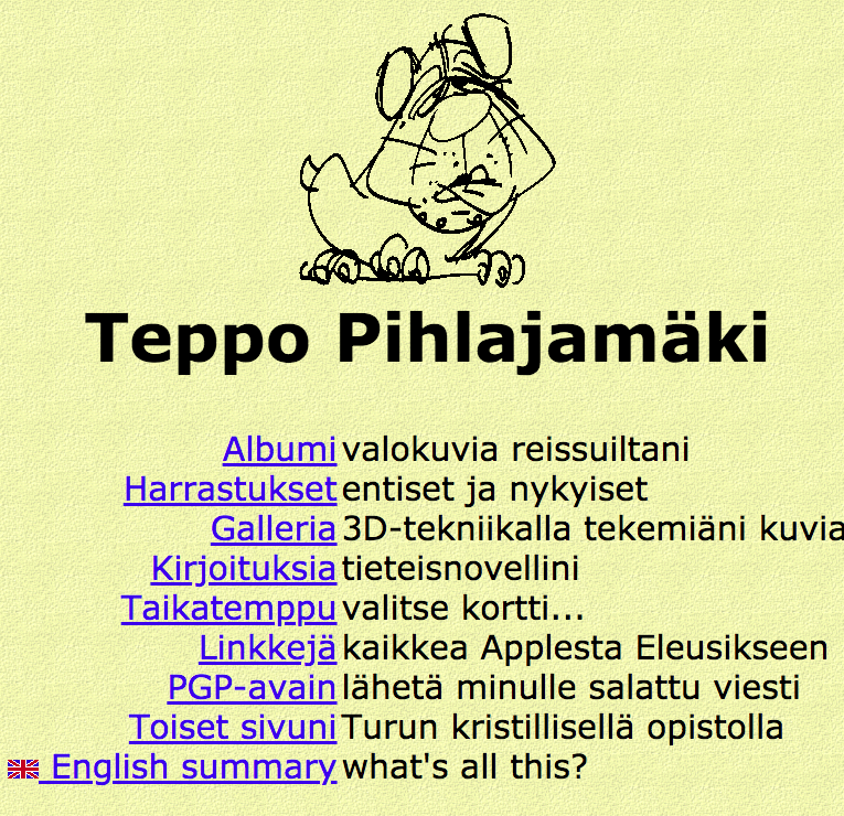
I then began studying in Turku Christian Institute to become a media-assistant. I had studied 3D-modelling on my own, so I decided to show off a little with this front page, where the background is a single picture. I got the visual inspiration from the Amarillo-restaurants, where there are yellow walls, dark wood and shady lights. The wood under the links was supposed to be shades, but because of their size they look more like the window was nailed shut. The broken letter P in the neon light is an animated gif. It stands out a little, because its quality differs from the background. The texts are their own elements and they are centred with javascript. Notice that this page centres vertically too! 
At this stage we rehearsed making all kinds of pages, and I thought their appearance may well differ from each other, so that I could experiment with different things. When my studies were closing their end, I asked for comments about my pages, and many people wanted a more unified appearance and less graphics. Some liked them as they were though. So I designed a new, utterly simplified layout, that would be fast do download and would work in most browsers with great certainty. Green-yellow colour scheme isn't copied from the old pages of Merita bank, it is there because I was looking for some kind of soothing effect. The end result is, besides soothing, a little depressing. 
Finally we have come to this layout you are viewing now. Earlier versions were either boringly functional or graphic extravaganza, but now I wanted to jump to mainstream and use graphics just the right amount. I wanted to have my own personal look, but optimize graphics so it wouldn't slow down the download too much. I combined the content from my personal site to the assignments we made at school, and I designed a new layout. The appearance was inspired by Finnish game sites, which often look like a cross between a publication and a machine. The table structure was intended to be more complex, but even the latest browsers couldn't render it correctly. In fact, Macintosh's IE 5.1 renders falsely some things that 5.0 already mastered. The same applies between NN 6.2 and 6.1. Latest improvement to the site is its catchy address, teppo.tv. Well at least its catchy in Finnish. Com and net were taken, and fi-ending is given only to companies, associations and presidential candidates. Name-ending would require a domain name in two parts, e.g. www.john.doe.name. Org just doesn't sound good. I then asked some girls which would be cooler, teppo.info, or teppo.tv, and the unanimous answer was tv. It is recognised all over the world, and kind of like means the tv-channel of Teppo. I believe that in the future television will be the most common browsing device, and tv-domain names become familiar to people because of such tv-shows as tilt.tv and ruokala.tv. Good news to the state of Tuvalu, to whom selling domain names is already the largest source of income! Pages I've madeOn my web pages I could experiment with some neat and handy pages I made in school or otherwise. Some of them used Flash, some DHTML. I used ready-made libraries, which I improved myself, but still it was impossible to make the pages work in every browser and operating system. Magic trick Doggie game Body mass index Chess clock (Removed because Flash-technology came to it's end) Art gallery Finnish last names Game arcade (Removed because Flash-technology came to it's end) Cryptogram (Removed because Flash-technology came to it's end) | ||